
Friday, January 18, 2013
Red Undergarment
After couching in the first fold, I was committed. As it didn't look right with just one fold, I had to put in the second fold on top of the tatewaku diamonds. I think it makes the undergarment look softer and more like the wood block. It's not obvious viewing it head-on, but when viewed slightly off to the side the folds show up. Don't know if it is kosher (how's that for mixed cultural metaphor) to put a fold onto the tatewaku novel effect for a JEC phase piece. This may eliminate me from considering going for Phase 10 and certification; which is not under consideration for me right now.


Wednesday, January 16, 2013
Gracie Woodblock
This is the original woodblock for Gracie. It is called The Geisha Itsutomi by Chobunsai Eishi (1756-1815)


I have not couched in the fold yet. In fact I may add in an extra fold by just couching on top of the tatewaku diamonds. I will sleep on that.

There are a lot of soft folds on the red undergarment. However with the tatewaku effect it is difficult to do a lot of them. I put in one fold by couching in a guideline and then breaking the lattice lines along the fold.

The tatewaku effect is more difficult to do than I expected. Maybe I should have used a 1F for the 2 side stitches. They are too subtle to see when done. And I forgot to check to make sure that the diamonds line up both horizontally and vertically - oh well.

I have not couched in the fold yet. In fact I may add in an extra fold by just couching on top of the tatewaku diamonds. I will sleep on that.
Monday, January 14, 2013
Kimono Undergarments
I used a very pale cream color for the knots in the lattice holding of the butterscotch undergarment, as gold knots fade too much into the foundation. Most of the round knots did not turn out with the perfect "S" shape according to Susan Stevens instructions. They are small enough that I hope they won't be obvious.
Then I started on the red underskirt. The static electricity was really bad today, even with licking the thread a lot, so didn't do much. I hope it's the winter condition and not a property of the red silk.
I am considering adding a fold on the red skirt - like in the original woodblock - to give it a little softness. That will involve "breaking" the steam rising (tatewaku) novel effect along the fold, and couching on a fold line. I am apprehensive as I haven't seen anybody else doing it.
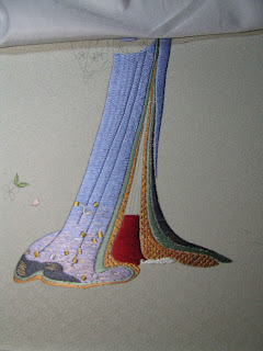
Then I started on the red underskirt. The static electricity was really bad today, even with licking the thread a lot, so didn't do much. I hope it's the winter condition and not a property of the red silk.
I am considering adding a fold on the red skirt - like in the original woodblock - to give it a little softness. That will involve "breaking" the steam rising (tatewaku) novel effect along the fold, and couching on a fold line. I am apprehensive as I haven't seen anybody else doing it.

Saturday, January 12, 2013
Lattice Holding

Wednesday, January 9, 2013
Kimono undergarment
Finished the foundation for the butterscotch inner undergarment. This will have lattice holding. I'm debating whether to use honey gold metallic or twisted silk for the lattice. I will have to try each in turn.


Tuesday, January 8, 2013
Gracie Teaching Notes
Mary Alice gave me the Gracie teaching class notes (a 47 page tome) during class. Since I already did a bit using only the French book and the paper picture model there were some "Oops, I did it wrong...Oh well... (not going to take it out now)" moments, plus some interesting cultural notes, as follows:
1. Color = rank. Black is the highest (only for the emperor) then red, then blue. ... Jewel tones are not used in Japan; they have no jewels. Blue is not used much (It caused much agonizing when I decided to use blue) Orange and gold are the usual colors.
2. This is a spring design, thus should use spring colors. Summer and autumn colors will conflict with the cherry blossoms.
3. Kimono undergarments would be brighter and more colorful to be eye-catching.
Now for the technique faux pas and tips:
4. For the kimono - there are NO blended threads; use 2 needles instead, one for each color (The two blending threads share the same hole horizontally, then the hole is covered by the holding thread - an Eureka moment for me!)
5. The stitches on the picture model are too short for the undergarment.
6. Very small one point open space between the undergarments.
7. Tapering the stitching from 1.5F to 1F as the undergarment area narrows towards the top.
8. For blending area, use thicker thread with softer twist.
9.Petal stitches should be shorter - else they will look like fish bones.
And the Oops-oops-oops - the eyes and eye brows on the design as printed(!) are too steep an angle. They should be closer to parallel to the foundation stitches. I like my Gracie's face anyway!
Today's accomplishment - the butterscotch color undergarment. I made a very small one point open space between it and the green undergarment and switched to 1F towards the top.

1. Color = rank. Black is the highest (only for the emperor) then red, then blue. ... Jewel tones are not used in Japan; they have no jewels. Blue is not used much (It caused much agonizing when I decided to use blue) Orange and gold are the usual colors.
2. This is a spring design, thus should use spring colors. Summer and autumn colors will conflict with the cherry blossoms.
3. Kimono undergarments would be brighter and more colorful to be eye-catching.
Now for the technique faux pas and tips:
4. For the kimono - there are NO blended threads; use 2 needles instead, one for each color (The two blending threads share the same hole horizontally, then the hole is covered by the holding thread - an Eureka moment for me!)
5. The stitches on the picture model are too short for the undergarment.
6. Very small one point open space between the undergarments.
7. Tapering the stitching from 1.5F to 1F as the undergarment area narrows towards the top.
8. For blending area, use thicker thread with softer twist.
9.Petal stitches should be shorter - else they will look like fish bones.
And the Oops-oops-oops - the eyes and eye brows on the design as printed(!) are too steep an angle. They should be closer to parallel to the foundation stitches. I like my Gracie's face anyway!
Today's accomplishment - the butterscotch color undergarment. I made a very small one point open space between it and the green undergarment and switched to 1F towards the top.

Monday, January 7, 2013
New Year's resolution - getting back into "serious" stitching. For the past several months I've been doing some easier needlework endeavors, mostly Christmas ornaments. A couple of examples


Bullion roses

Stumpwork

The purple rose is a practice piece - not very Christmas-y.
I also worked on the Polar Shadows piece (not finished), and it's not easy, which is what's driving me back to Japanese embroidery.

Before starting back on Gracie, I took a deep breath, organized the equipment, tightened the frame, took a picture, and wait till tomorrow.

Subscribe to:
Posts (Atom)